Dining Room Makeover Part 1: The Before, The Plans, and Progress so Far
Hi everyone! I’m super excited to introduce the start of my dining room makeover to you!
If you’re new here, thanks for stopping by my corner of the internet! A year ago, I moved into an older 750 sq. ft one-bedroom rental apartment that I’ve been decorating, and blogging the process since! You can catch up on all the posts on my progress so far here.
We’re about halfway through redesigning our living room, but are putting that space on hold while we decide on/save for a new sectional sofa. In the meantime, I’ve turned my attention to our dining room! So today is a LONG overdue catch-up of everything we’ve done to it so far, and the plans to complete it.
The Before
So let’s start with some terribly lit, low-res before photos.
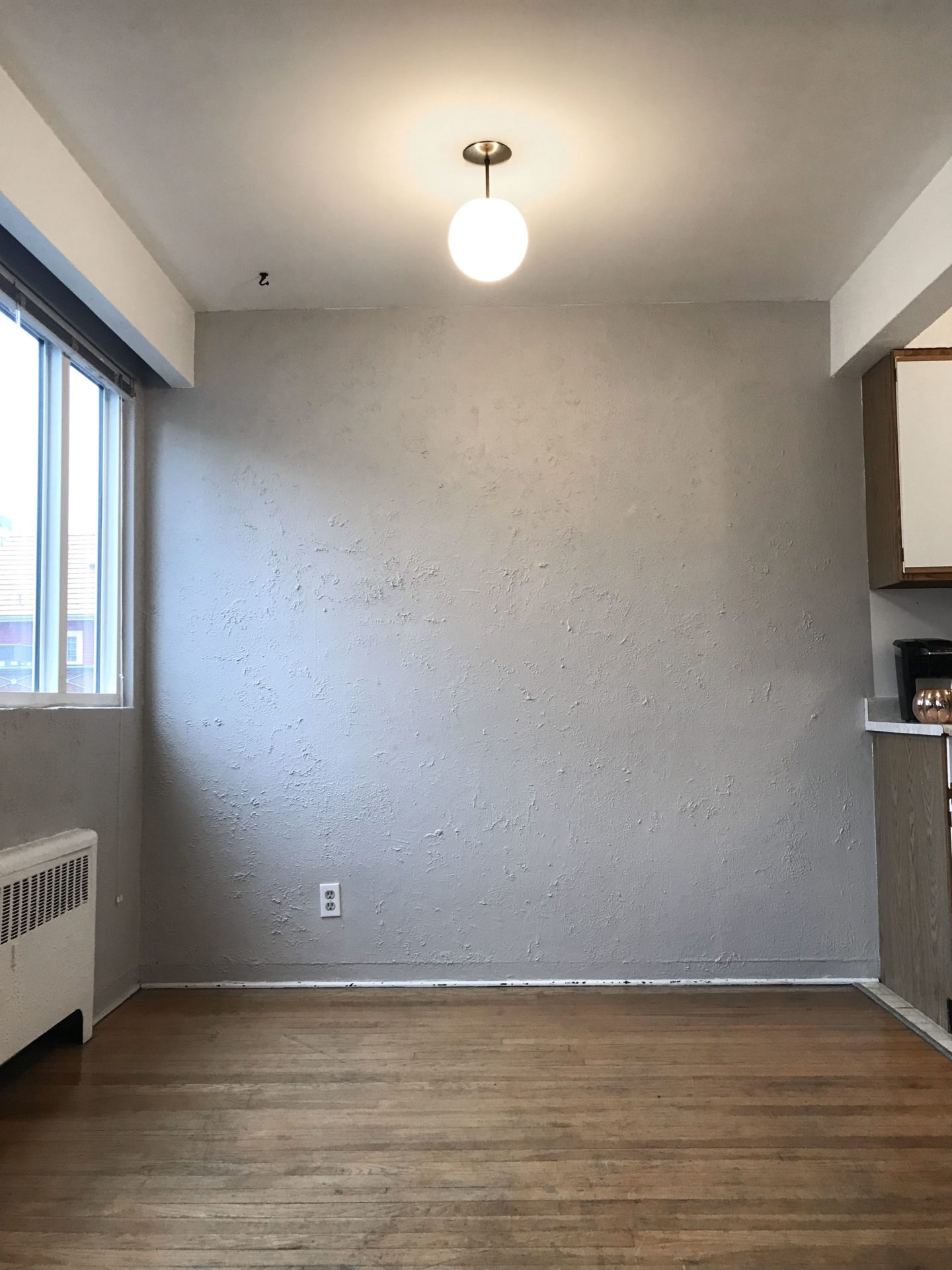
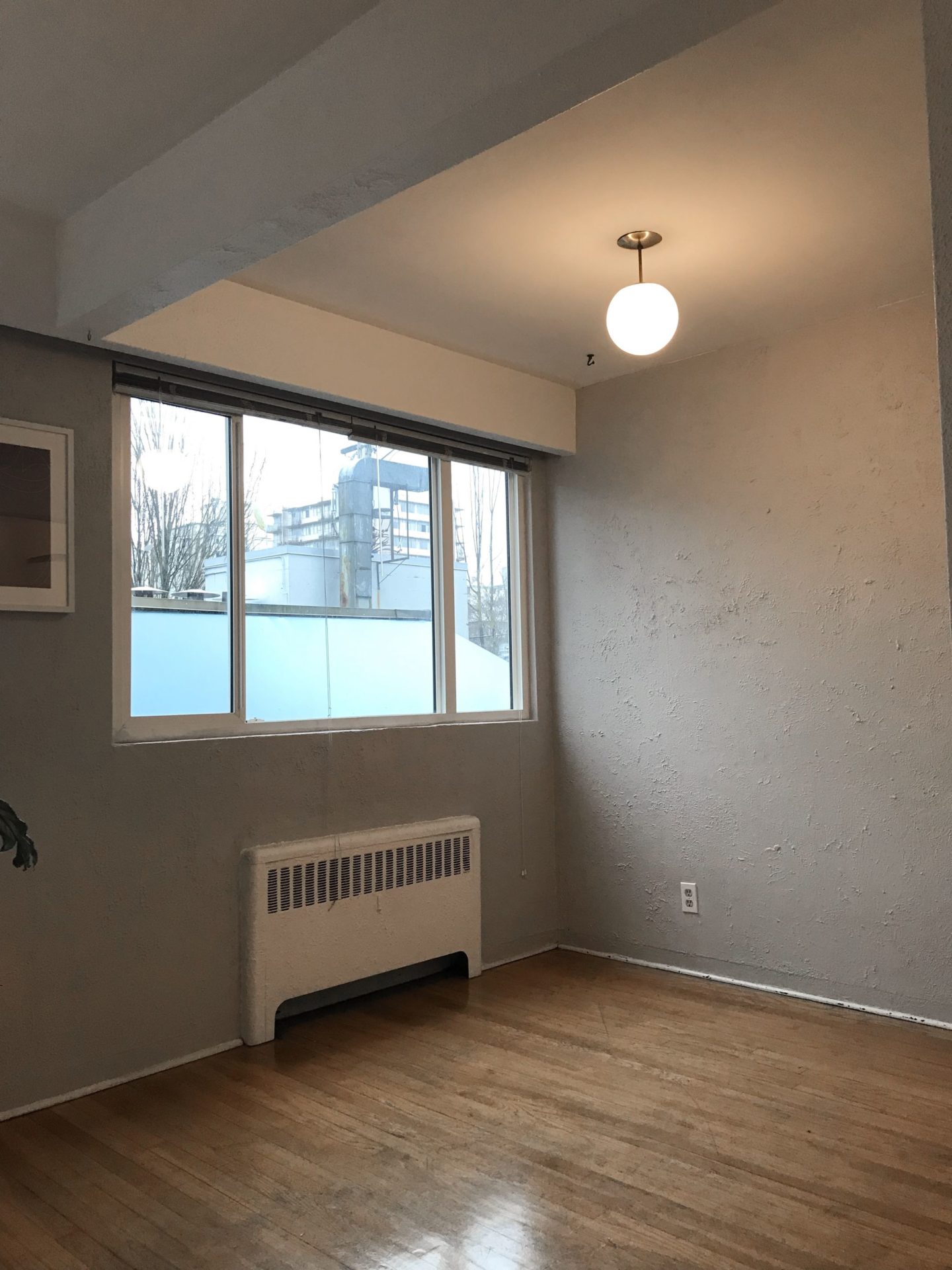
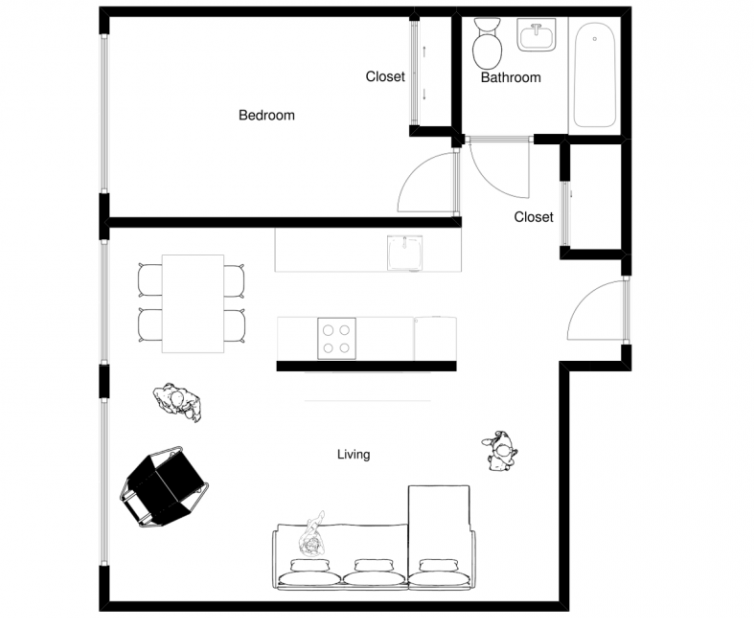
As you can see in our apartment’s floor plan below, the kitchen and living room both flow into the dining room (dining area? dining space? Does the tiny thing even count as a room?). The dining room is also one of the first things you see directly in front of you when you walk through the front door. So it’s super important to me that I turn it into something that is beautiful when viewed from both angles.
Now, the overall space and size that we are starting with with are actually pretty great, but like any rental, comes with some challenges. The walls have a textured, plaster finish that just look messy and very dated. There are also load-bearing beams coming down from the ceiling that visually “box in” the room, making feel more closed off and smaller than it actually is.
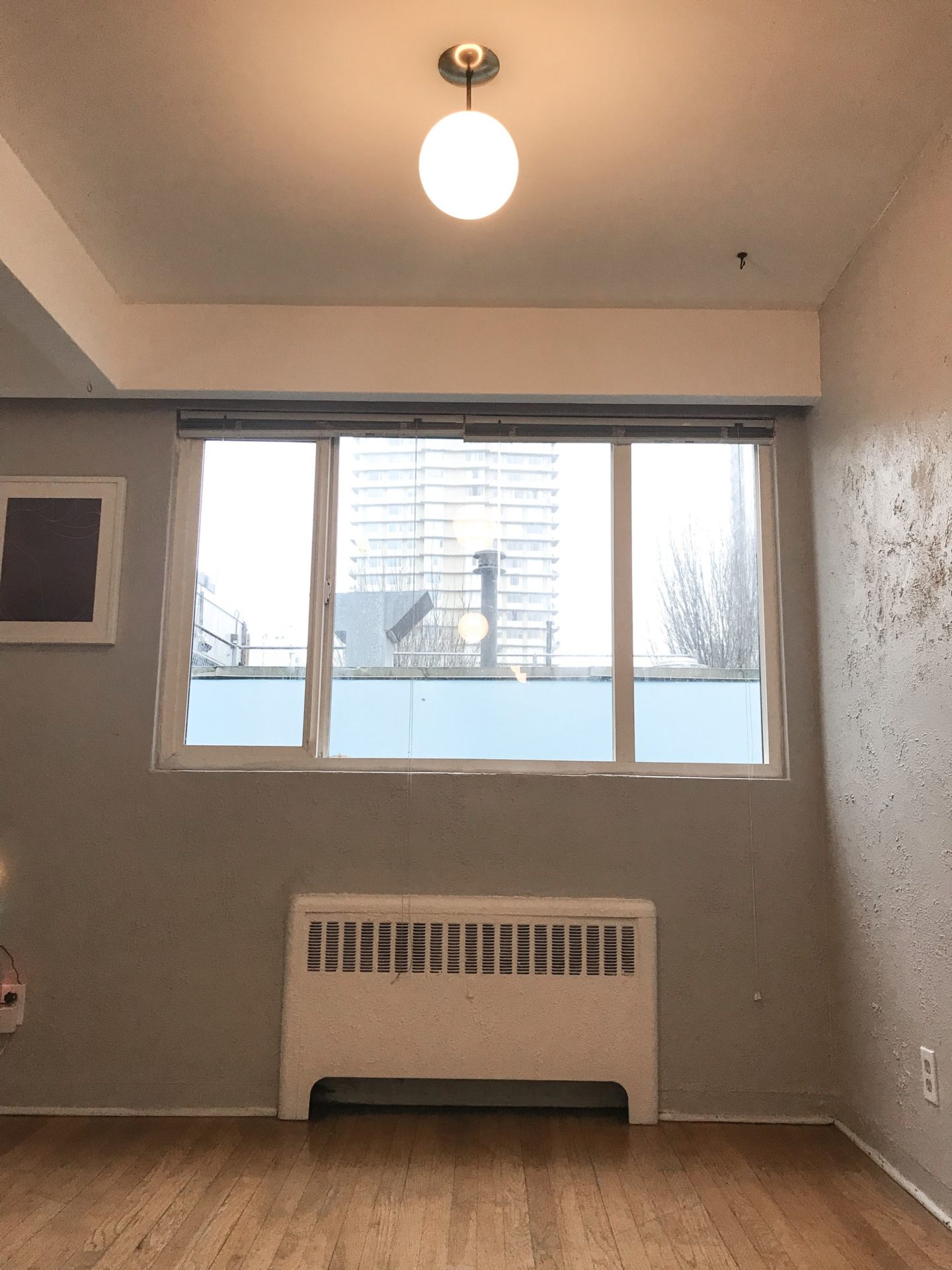
As for the qualities I’m am excited about? I can definitely fit at least a 4 -person table in here, there’s a big window providing a TON of natural light, and the ceiling’s electrical is hardwired for a light to fit perfectly in the centre.
The last one may seem like a small thing to celebrate, but from what I’ve learned from renting older apartments, you celebrate open layouts and centred electrical when you can! (Our living room has no overhead lighting, and our bathroom was built with NO outlets)!
The Inspiration
With a clear vision of the room, it’s time for some inspiration photos.
This was easy because I already have the living room mood board that I originally made last year (and am still obsessed with it). If you’re not caught up, I’ve included it below for context. I’m using it as a reference point to guide the planning and buying decisions for our entire apartment, so that the spaces look cohesive even if I go back and forth between adding pieces to the living room, then the dining, then back to the living room. Because one room flows in to the next, they need to look like they belong together.
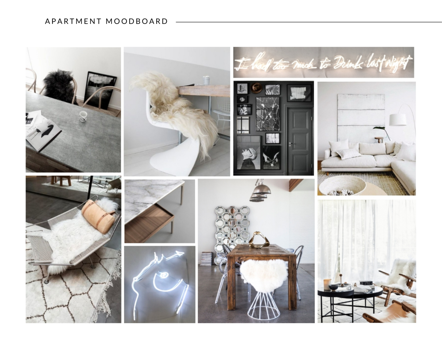
I would describe the aesthetic I’m chasing as warm, modern minimalism with a historical edge. The minimalist in me couldn’t be more obvious by the lack of colour and pattern, and clean lines. However, I’m not one to shy away from statement pieces of a grand scale, and especially those with historically significant or vintage finds. (I’m still searching for the perfect vintage rug).
Now here are some of the ideas I gathered that inspired my design direction for the dining room:
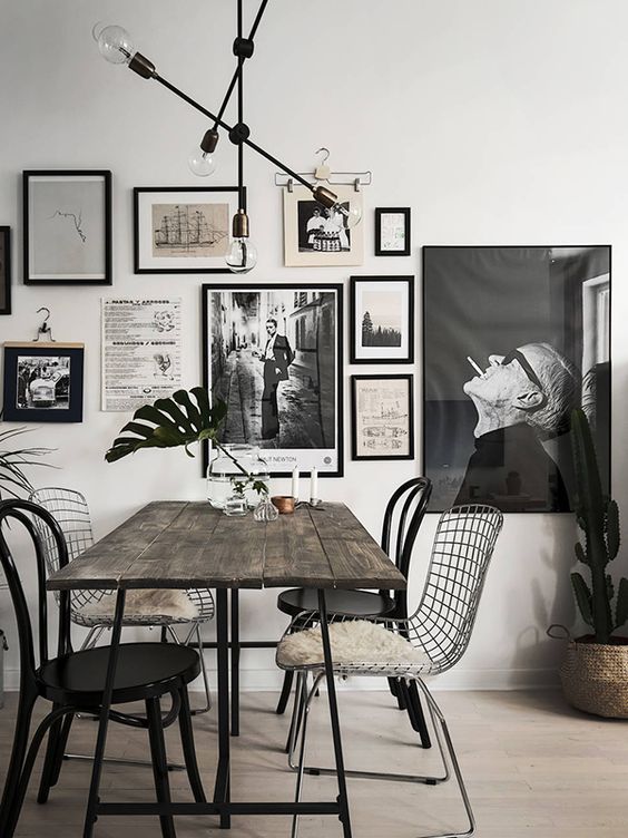
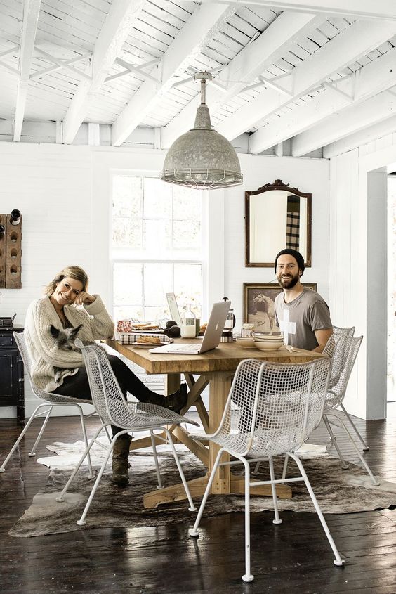
Mismatched chairs with a reclaimed wood table… YES. 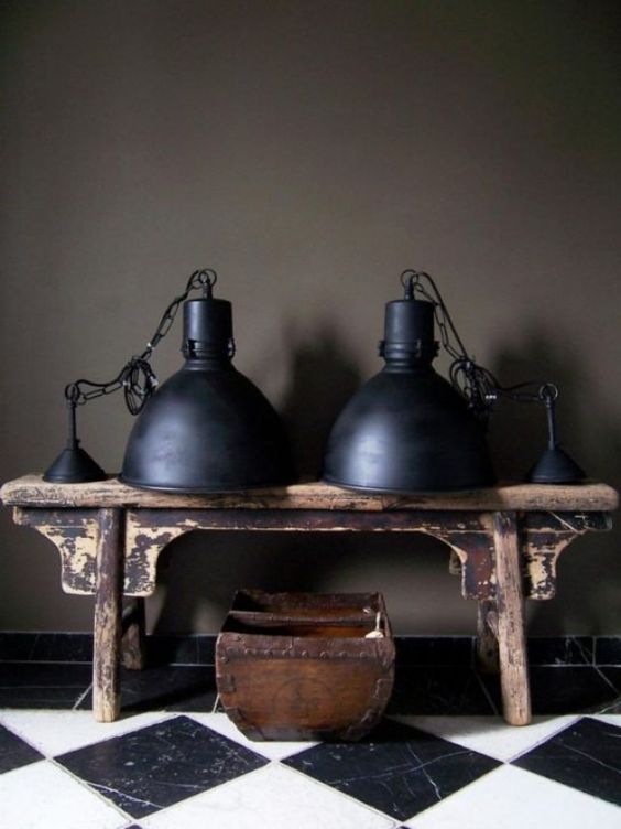
Love these industrial factory lights. 
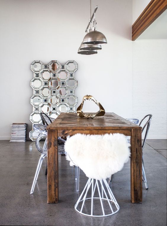
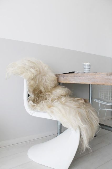
I love vintage designer chairs with historical significance, like this 1960’s Panton chair. 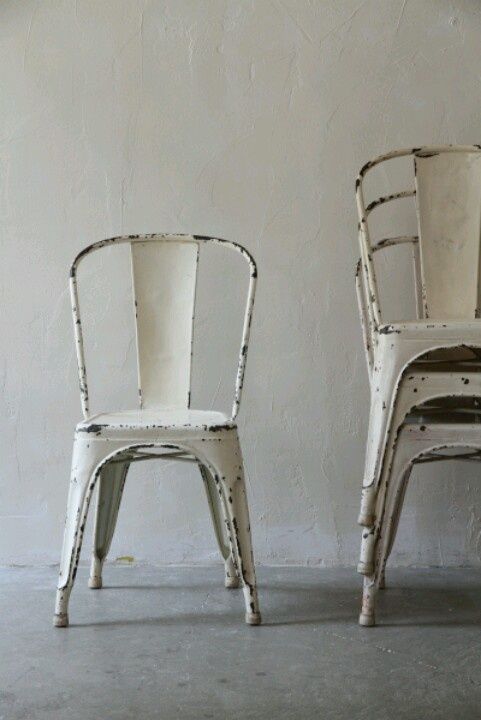
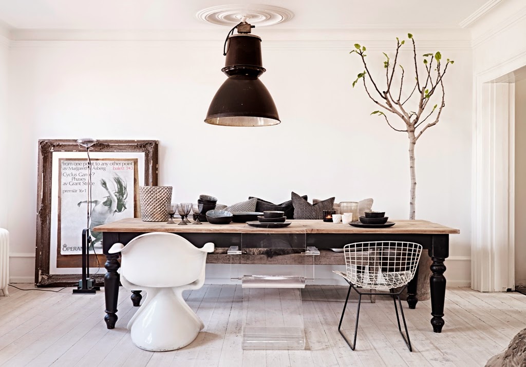
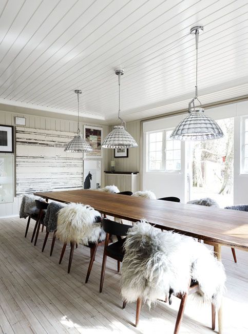
More mixed chairs and industrial lighting. 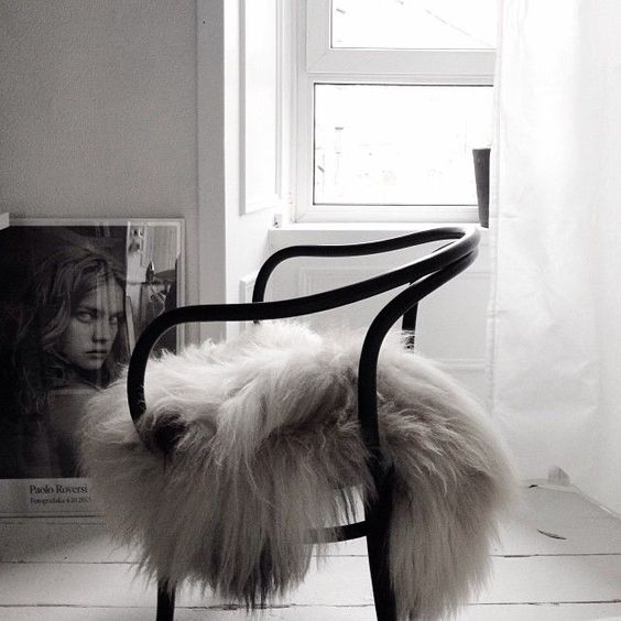

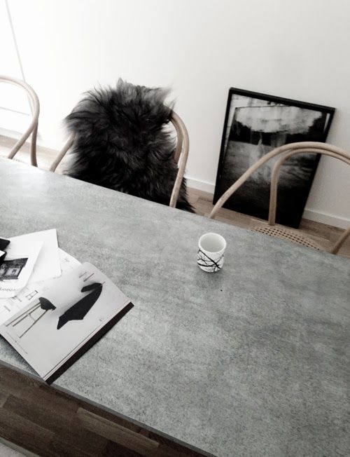
Lots of sheepskin textures to soften up the industrial masculine elements.
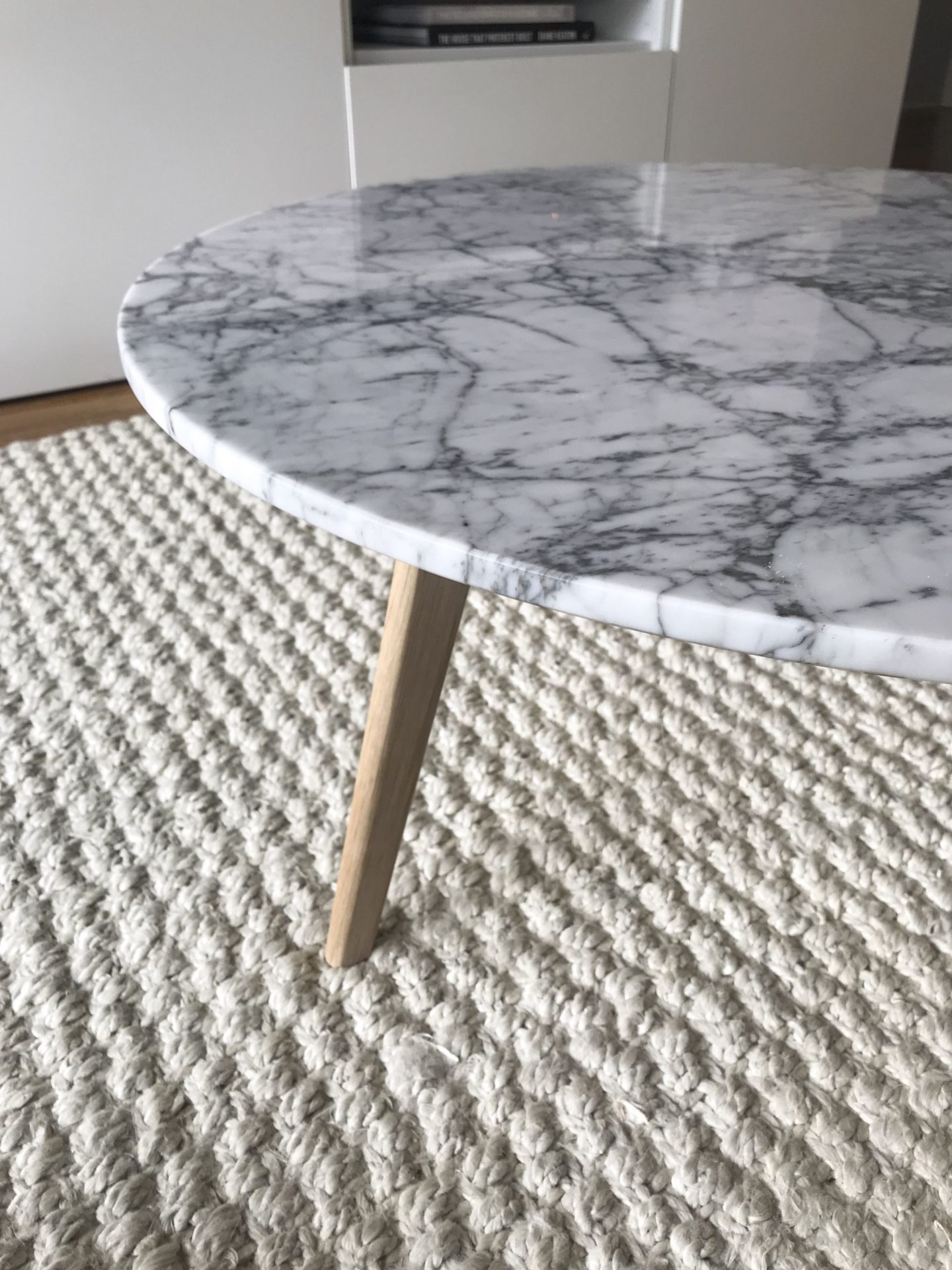
When I first starting poking around for dining room inspiration, I knew I wanted a mix of modern and vintage. From the get go I wanted to find the perfect reclaimed wood dining table. A reclaimed wood table made sense with what we have going on in living room so far: the worn reclaimed wood will warm up the space, and contrasts nicely against all the “modern surfaces” — our marble coffee table, metal side tables, and acrylic bar cart.
(P.S. I don’t think I’ve shown you my living room coffee table yet, but here it is).
Back to the dining room. After scouring Craigslist for months, and seeing nothing I liked under $800 online, I found the PERFECT reclaimed extendable dining table for $250 CAD (which retails for $860 CAD new at Modlish)!
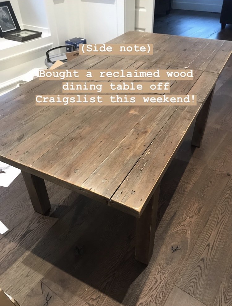
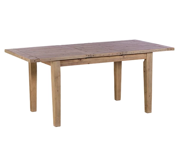
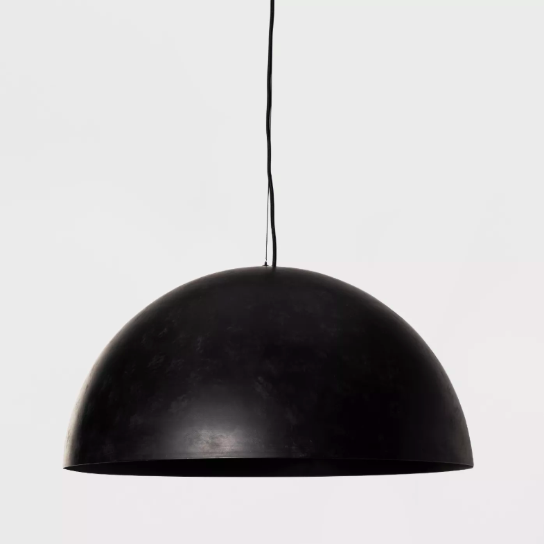
Finding the dining table REALLY got the ball rolling on everything else. I started looking for a bold, oversized statement light to anchor the room. I was especially drawn to repurposed factory lighting, as you can see in the photos above.
In the end, I tracked down an oversized industrial pendant light from Leanne Ford’s capsule lighting collection for Target on eBay (it’s been sold out for a year, and as a capsule collection it’s not coming back)! Luckily, the seller’s price was reasonable and it arrived in brand-new condition.
With two major decisions out of the way, here’s my first iteration of a design plan.
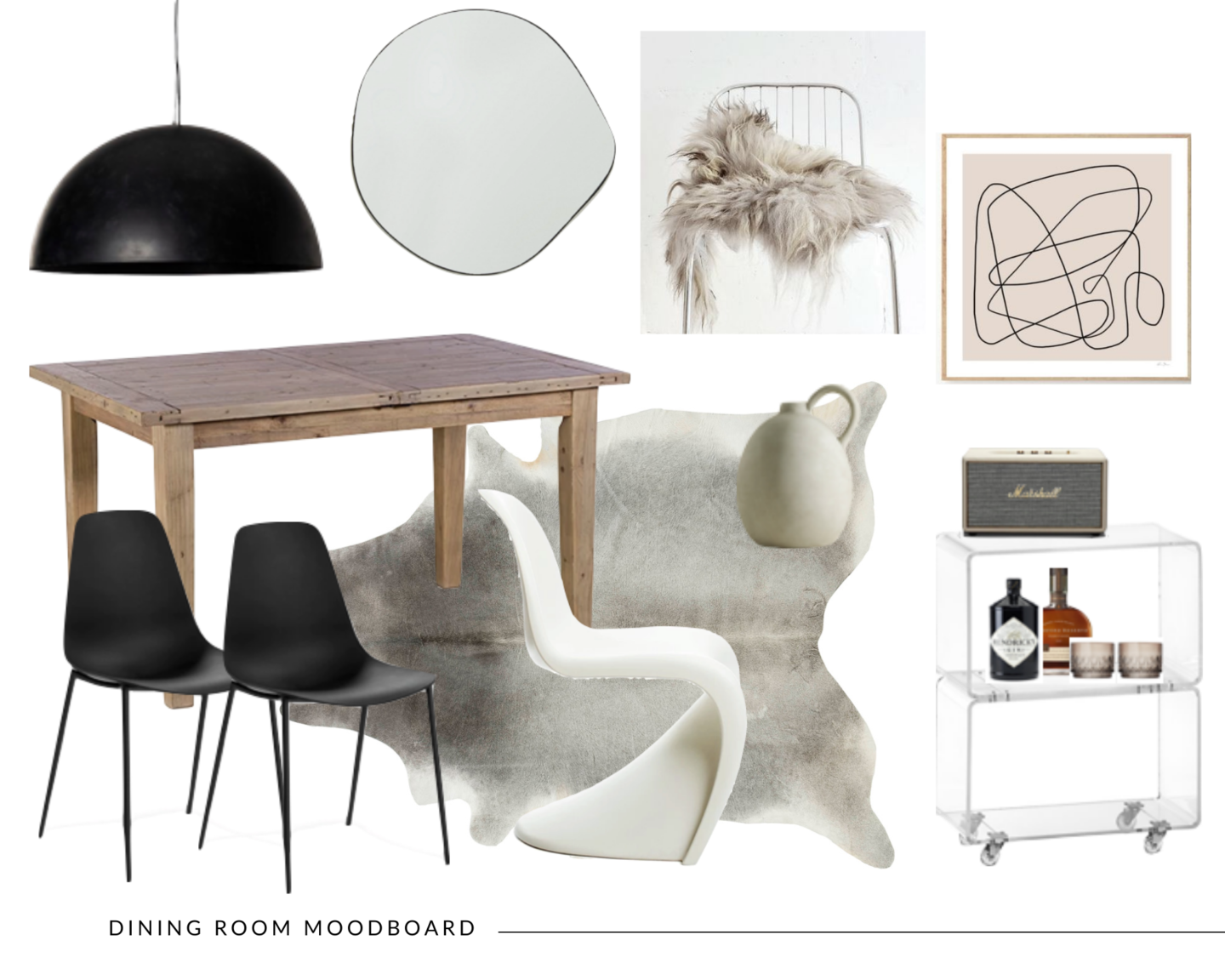
We’ll see where we land with the art, rug, and chairs — I still haven’t found THE prefect ones yet.
There’s a lot that I’m still pondering over, but here’s what’s left on the “to do” list for the dining space:
- Interesting art for above the bar cart. I’m keeping the acrylic bar cart I brought over from my last place. The print in the moodboard above is just a placeholder until I find something I fall in love with.
- A 5×6 or 6×7 rug to break up the wood floors from the wood table. This might be like fitting a square peg into a round hole, because rugs of these dimensions are not commonly sold, but a cowhide might work. It also needs to be neutral and low-pile.
- Swap one or two different dining room chairs to mix in with the Article Svelti chairs we currently have. I am so into the look of mis-matched chairs. I would love to see if I can fit one Panton chair and mix a few different mid-century silhouettes. I might be asking too much of this small space.. it could look crowded, quick.
- Repaint the entire living/dining a bright white
- Add natural/organic items for styling – sheepskin chair covers, a ceramic vase, and maybe pampas stems for added texture.
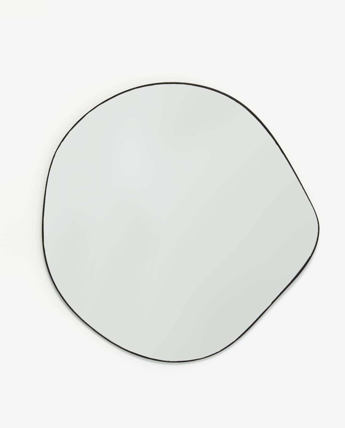
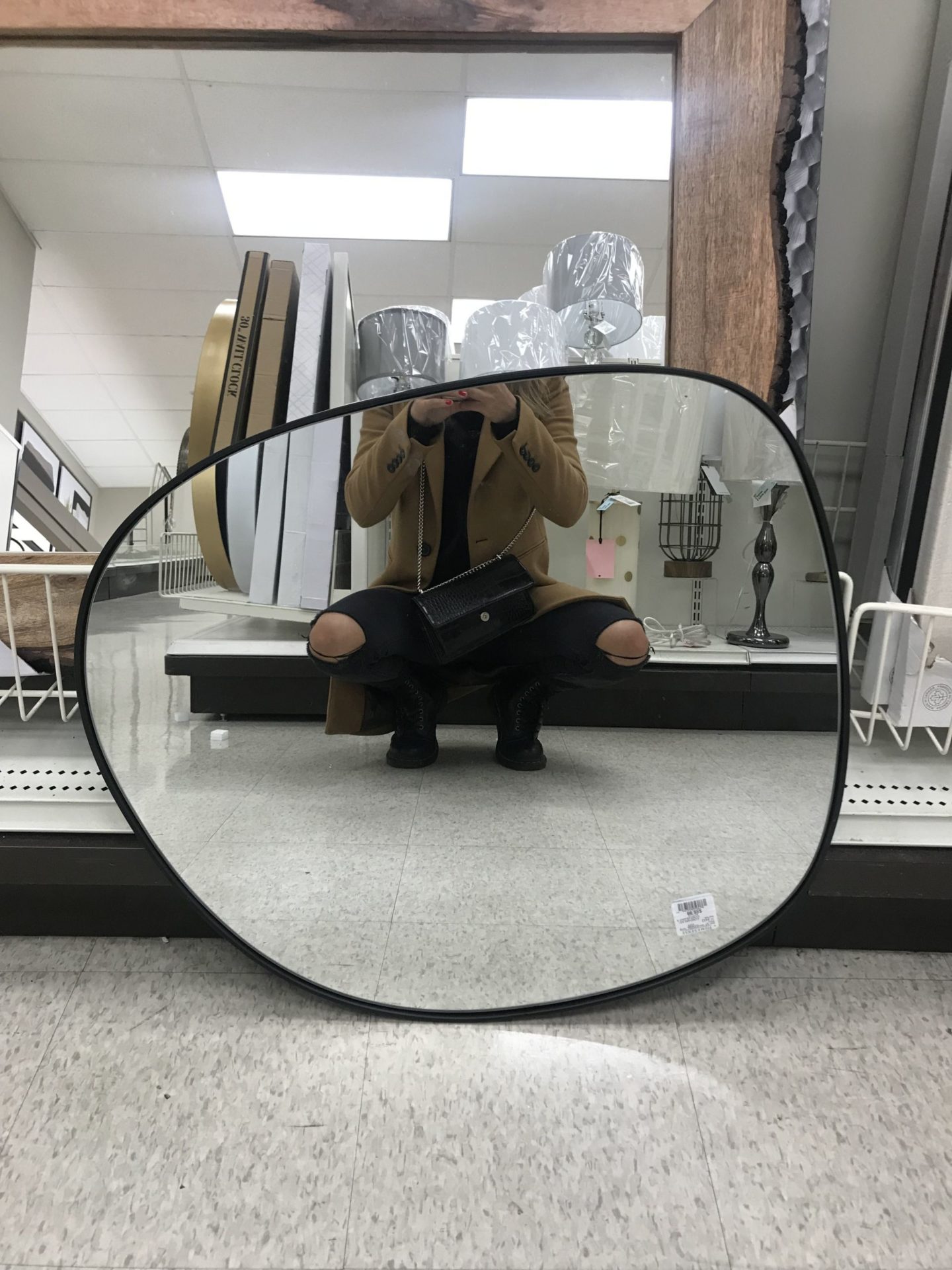
Coincidentally enough, I found an almost exact match of the $250 Zara mirror in the moodboard above at HomeSense for $99. During a different visit, I also scored an asymmetrical clay vase for $15 similar to the much more expensive ones I’ve been pinning. I guess my once-a-week visits are paying off!
So there you have it. 50% through, and very happy with some of the finds so far. I do hope to complete this by the new year, so if you have any rug/chair recommendations, leave them in the comments below!
Final thoughts — design isn’t a linear process. Styling a dream home takes time, patience, and thought.
In the meantime, you can follow along the design process on Instagram. For more dining room inspiration, check out my Dining Room Pinterest board!

December 10, 2019
Stay Inspired
Subscribe below to get new blog posts, updates, and inspo straight to your inbox.