What I Have Planned for our New Apartment: Before Photos, Mood Board & Inspo
We are 4 months into living in our new place and it’s about time I sat down to share the plans for this apartment! I have been posting small glimpses of updates on my Instagram stories–there are 13 weeks of highlights if you want to catch up–but today I’m summing up everything into one giant blog post highlighting some of my inspirations along with the before photos, the mood board, and the general plans thus far.
The Space
So let’s start with the empty space. My boyfriend and I moved into an older one-bedroom rental apartment back in September. What it lacks in modern appliances (no microwave, no dishwasher, no in-suite laundry) it makes up for with affordability, location, its open concept, and space! If you’re also from Vancouver you understand the challenge of finding an affordable place that isn’t a straight-up shoebox or a curtained off “bedroom.” We are even blessed with decent sized windows and are a block away from the beach.
Before getting into the inspiration and mood board, here is the apartment’s layout I whipped up to scale.
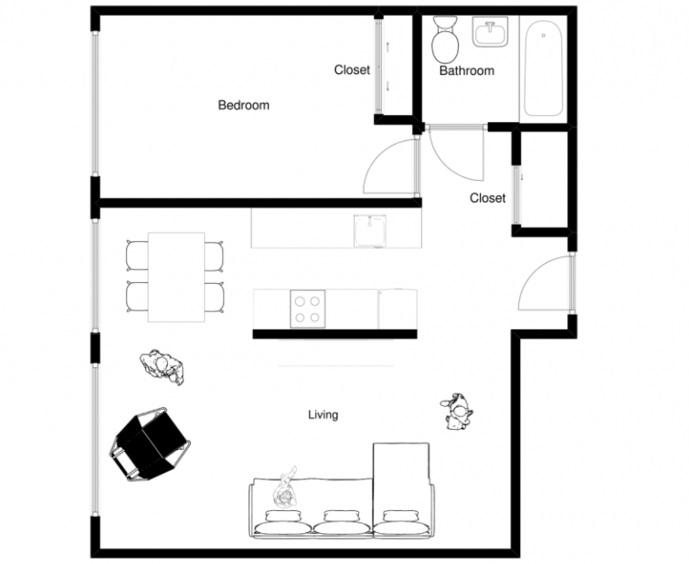
I wasn’t blogging when I moved in, so I don’t have proper empty apartment “before” photos. But here are some images of the dining and living area to help you visualize the space:
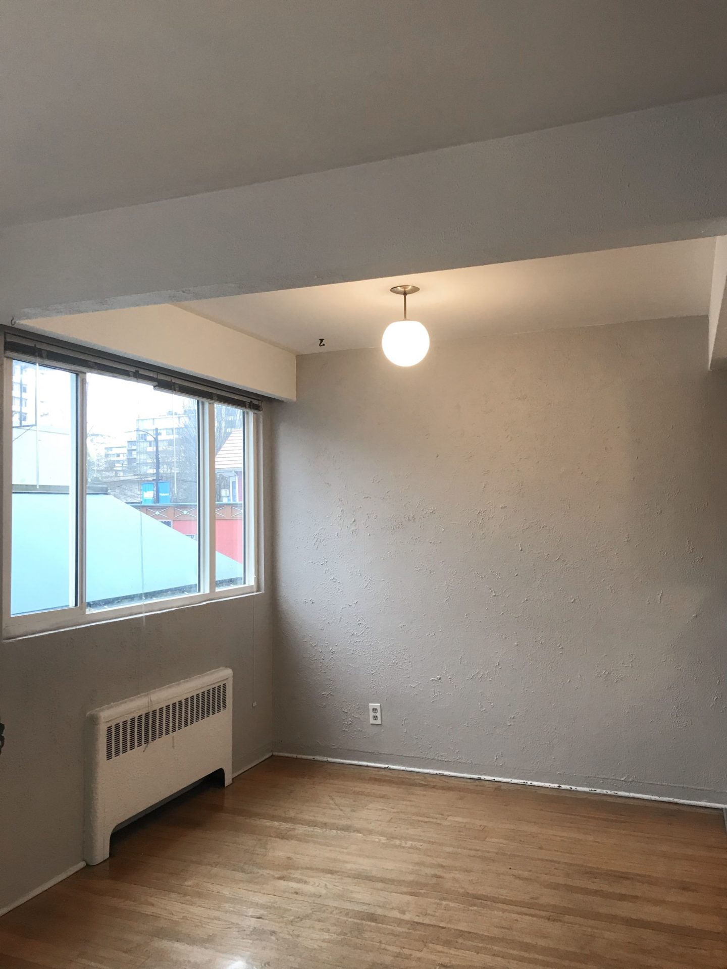
View from the living room looking into the dining area….
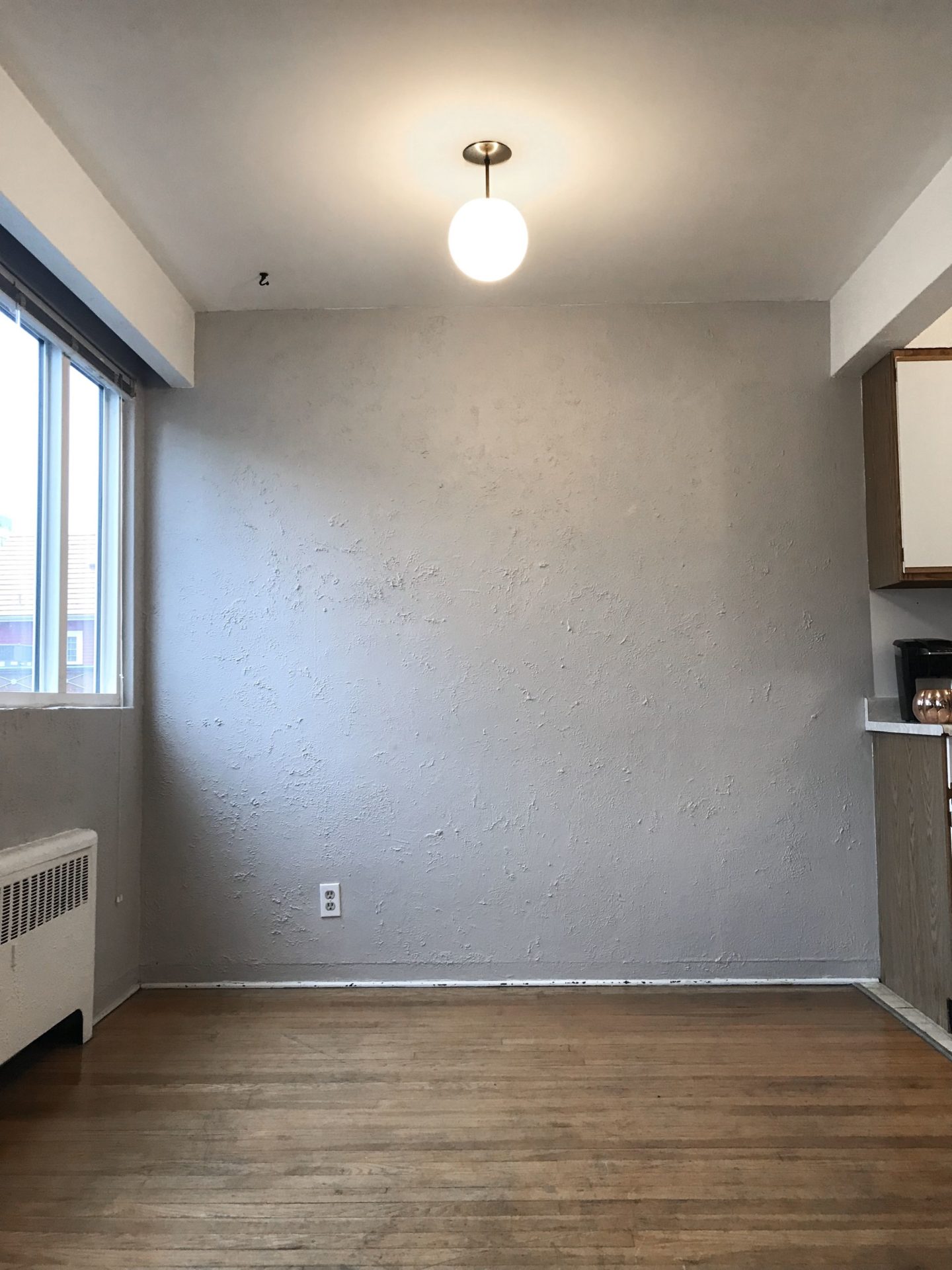
The dining area straight on from the living room. You can see where the kitchen starts directly to the right. Not crazy about the textured walls but I’m so in love with the mid-century modern brass globe light fixtures!
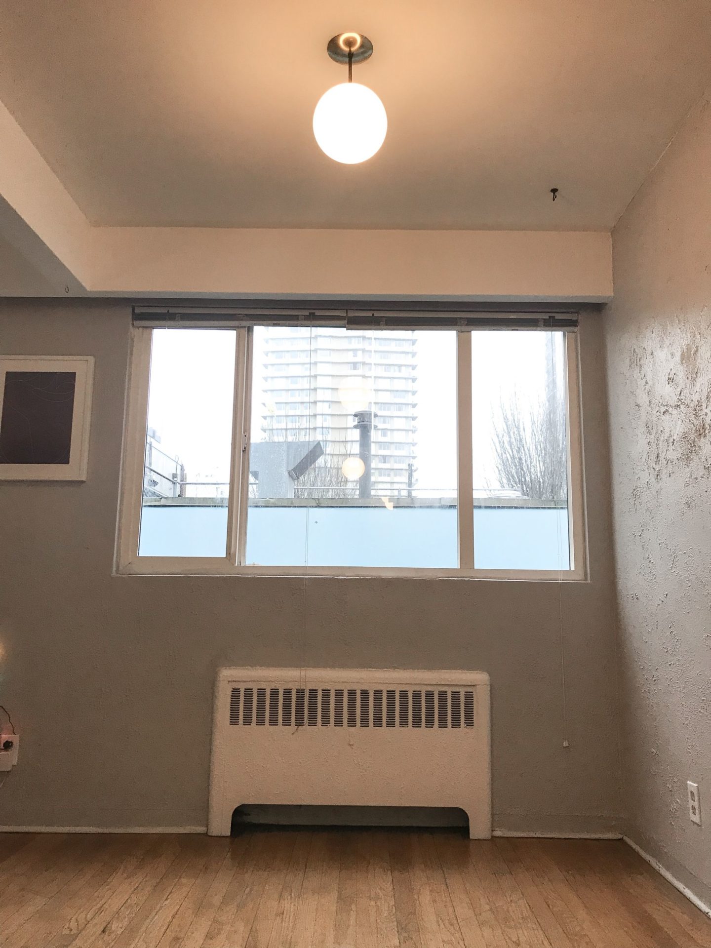
And here’s the view from the kitchen looking into the dining area.
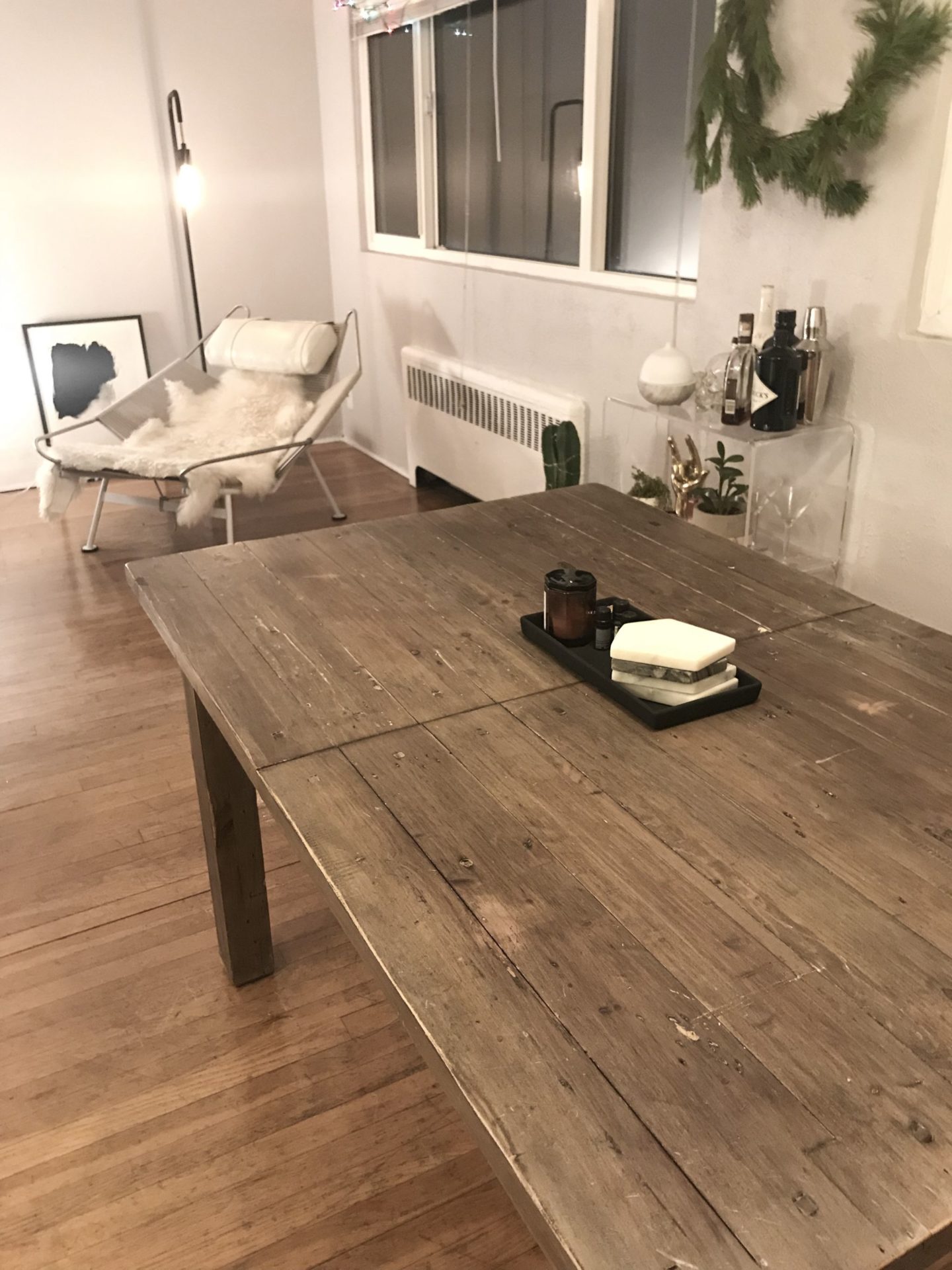
Fast forward to this week, which are the only photos I have of our living room. The dining area opens up to a long living room area. Oh yeah, and that’s the reclaimed wood dining table I picked up on Craigslist!
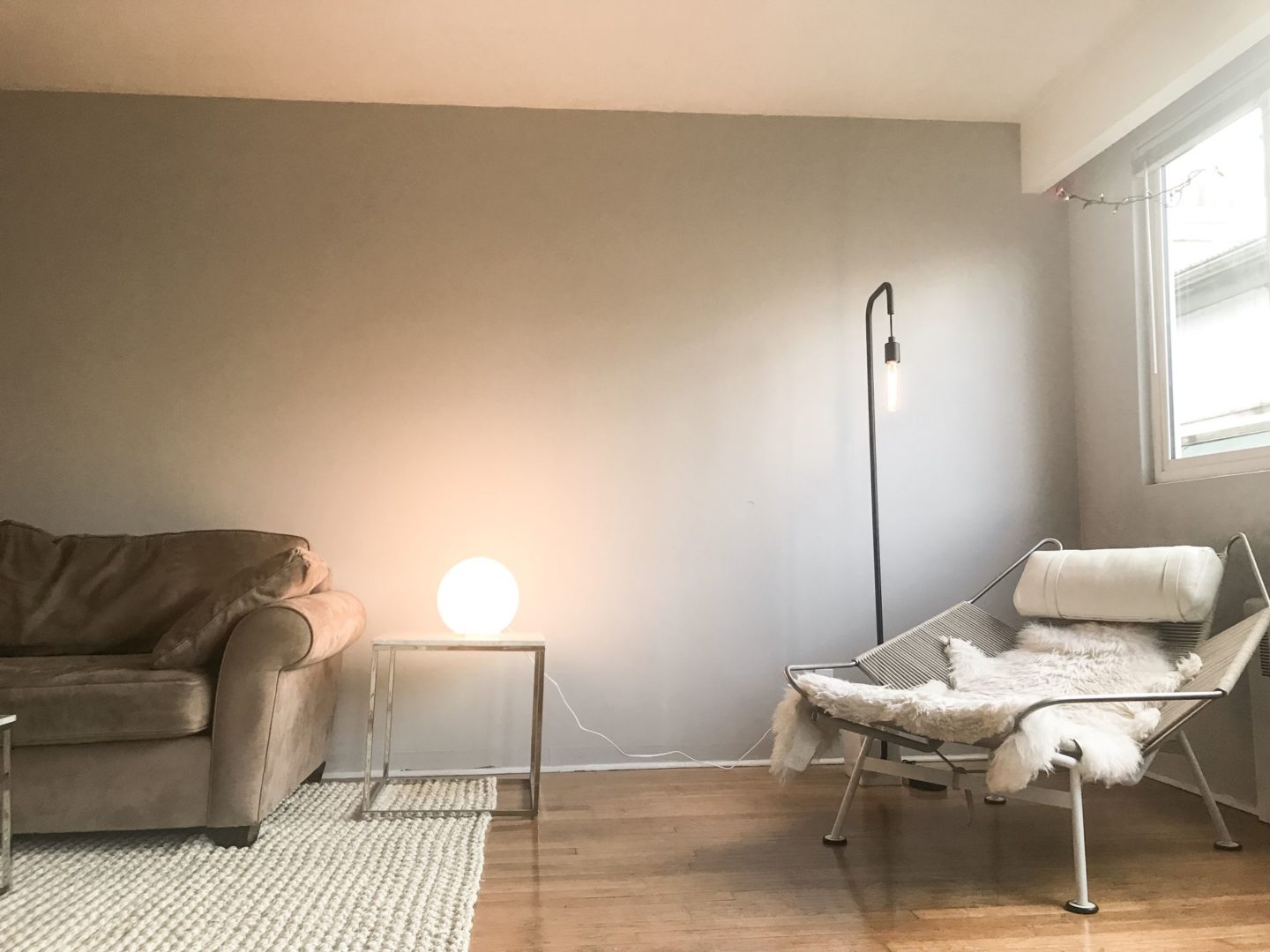
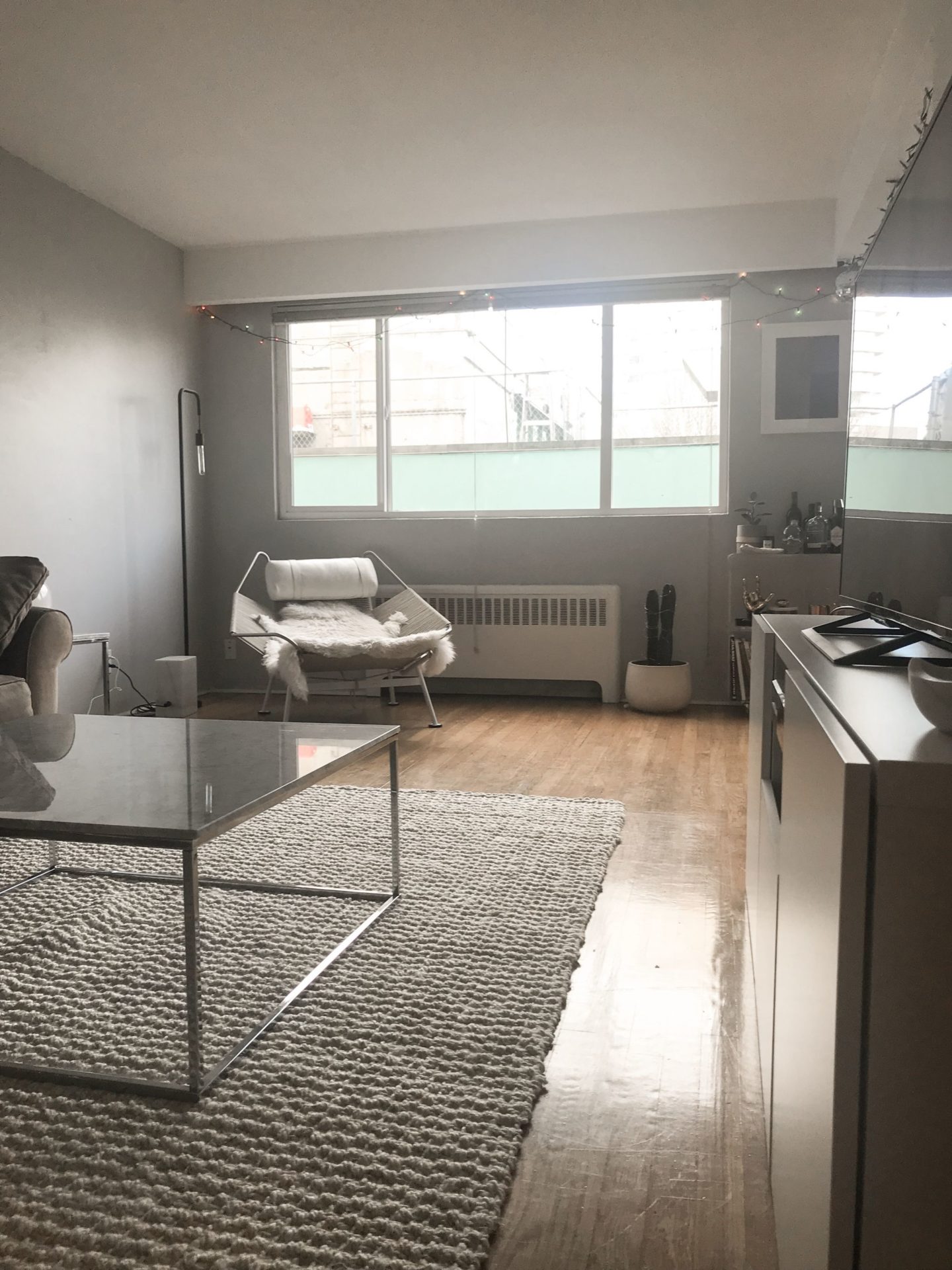
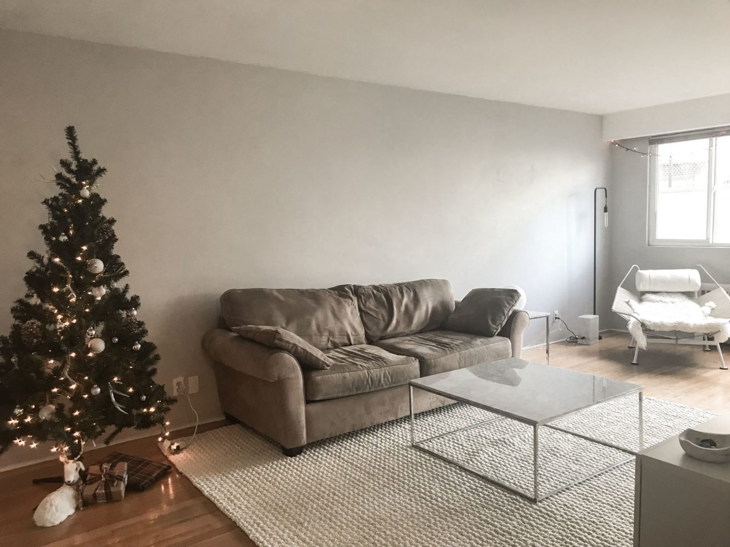
This photo gives you an understanding of how LONG this room really is. At just over 21 feet I’m finding it hard to fill up. We’re thinking a new big comfy sectional that wraps around where the christmas tree is, a gallery wall to the left and lots and lots of book shelving.
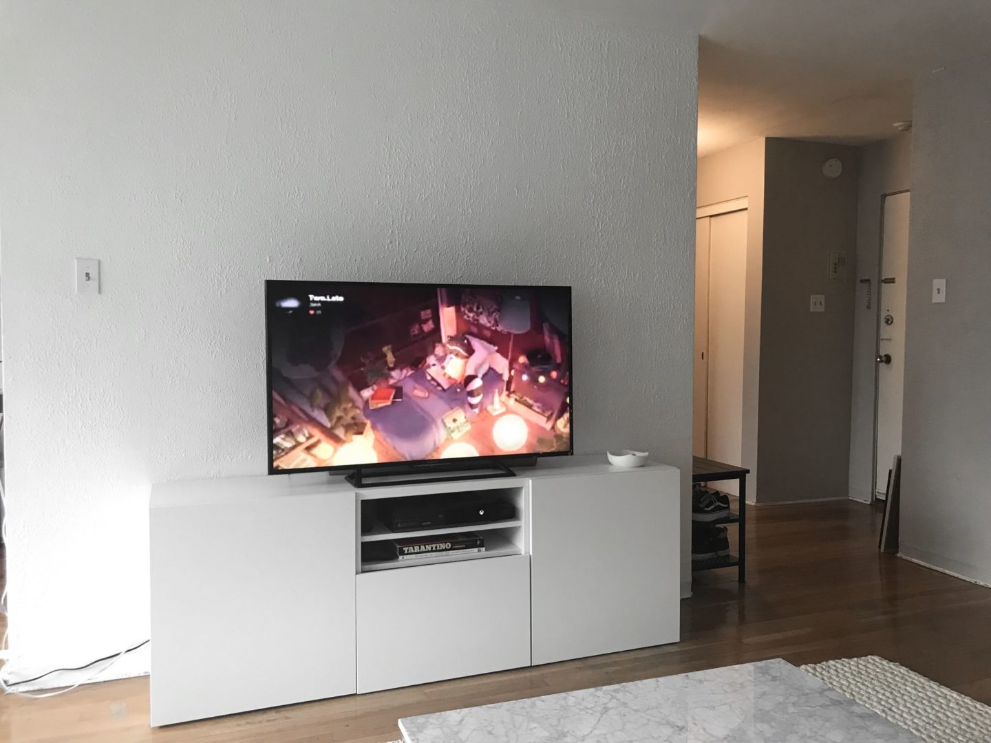
View of the other side of the living area, sitting on the couch. We picked up this IKEA besta unit which I can’t wait to style to give it some personality. Here’s a bizarre thing about this apartment: there’s no electrical outlet along the TV wall. Right now we have the cables running along the bottom left side and plugged into our kitchen. The living room also has no overhead lighting, so brightening up this darkish room is another goal of mine.
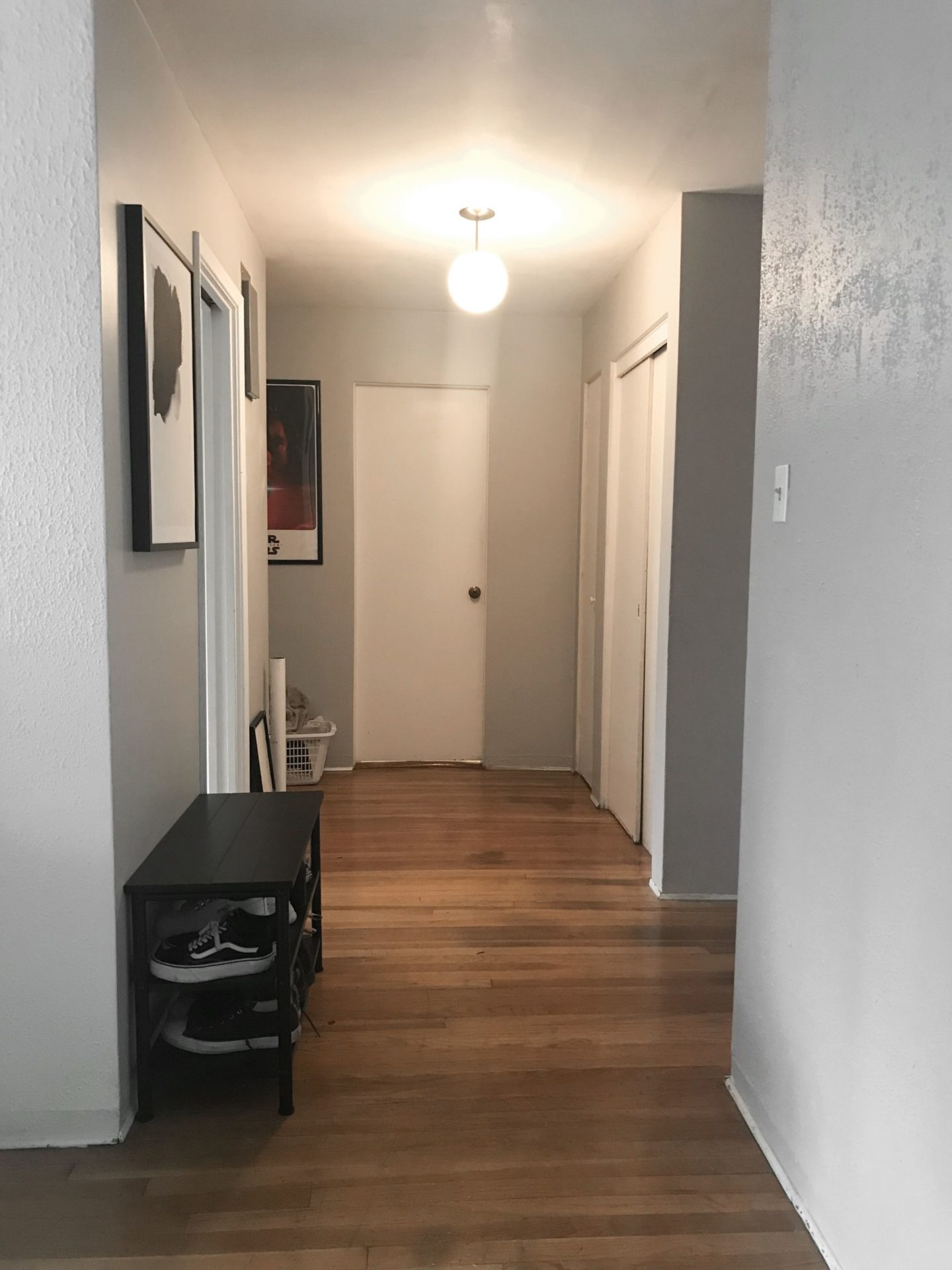
Far right side of the living room, looking down the hall.
So it’s old, and has a few weird quirks – but I love the layout, how spacious it is, and how much we can do with it!
Mood Board & Plans
Creating mood boards to guide the overall look and feel is a creative process I love but is as practical as it is enjoyable. I use it as a reference point to guide all of my planning and buying decisions. It helps me pull furniture pieces that work together and avoid impulse buying a pink velvet sofa because it was on sale and made me feel like Elle Woods. It also helps me tackle individual rooms one by one, yet still have everything come together cohesively.
I’ve had ambitious dreams of how I envision our new place to look since we signed our lease in July. That being said, when creating a mood board I tend to tweak it one hundred and one times to make sure the look is achievable in an older rental apartment and realistic of what I can do on a lower budget. This meant saying goodbye to marble kitchen dreams (we have linoleum kitchen tile) and to mounting our TV (the plaster/stucco wall is too weak too support the weight).
I’m also a firm believer in living in a space for at least a few weeks to discover how you use it, and what you really need before buying anything. This is why despite my overwhelming excitement to just START, my philosophy that I stick to is plan ahead, and buy slow.
After living here for a few weeks I knew I want to create a more lived-in, casual atmosphere that reflects the laid-back feel of the beach and ocean outside. Or perhaps it’s because in my last apartment, my friends would constantly tell me they were too scared to sit on anything and it STILL haunts my subconscious. I don’t want anything to be “too nice to sit on,” or too precious that it can’t be spilled on. Case in point: I spilled a full bowl of ramen noodles on my brand new rug because I was balancing the bowl on the arm of the couch. And, let’s be honest, even with a spacious dining area I will always and forever eat 98% of my dinners sitting on my couch watching RuPaul’s Drag Race.
I also wanted to break my usual all-white palette for something more interesting, less predictable. While I do love all-white interiors, they tend to look empty and monotone without a mix of different materials and textures. I could get away with it in my last place because of the old brick walls and exposed pipes, but this time around I’m digging a color palette I’m calling “layered neutrals” – a backdrop of white and beige with layers of matte black, reclaimed wood, concrete, metal, and neon lighting to keep things from looking stark. I am in love with the contrast of old vs. new, masculine vs. feminine, dark vs. light – so you’ll see this throughout the living/dining mood board and continued into our bedroom later on.
So without further ado, here is how all of that came together into a mood board:
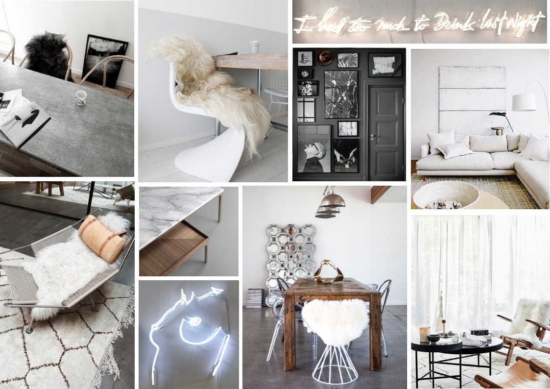
What do you think? If you’ve been following my Instagram, you might spot that I’ve made a few changes to the original version I posted. However, in keeping with my usual design aesthetic, the feel is still very modern, minimal, and monochromatic. I hate clutter, and too much stuff can get dusty and hoard-ish quick in older apartments.
The Inspiration
Here are some of the images that have been the most influential throughout my planning process, with some of my plans so far. I’ll be sharing updates for each room over the upcoming weeks, and you can see the day-to-day progress on my Instagram highlights. (And if you want to see even more inspiration, I have 4 months worth of ideas saved to my New Apartment Inspiration board on Pinterest because I am a total psycho)!
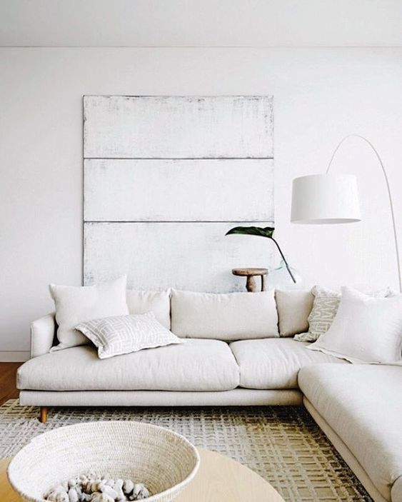
I definitely want a big, comfy sectional in a light-colored fabric for the living room. I’m currently eyeing the IKEA Soderhman sofa in white (next photo) because it is affordable and has removable, washable covers, but it still needs to pass the comfort test. And even though the website describes the covers as “stain-resistant,” I’m skeptical of any white fabric being all that resistant. It may come down to me needing to decide what’s more important: having a light colored sofa or being able to eat food on the comfort of my sofa. Wish me luck! Image source: Hare + Klein Interiors
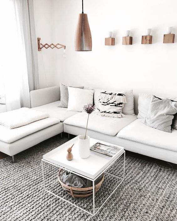
IKEA Soderhamn sectional. Image source: unknown
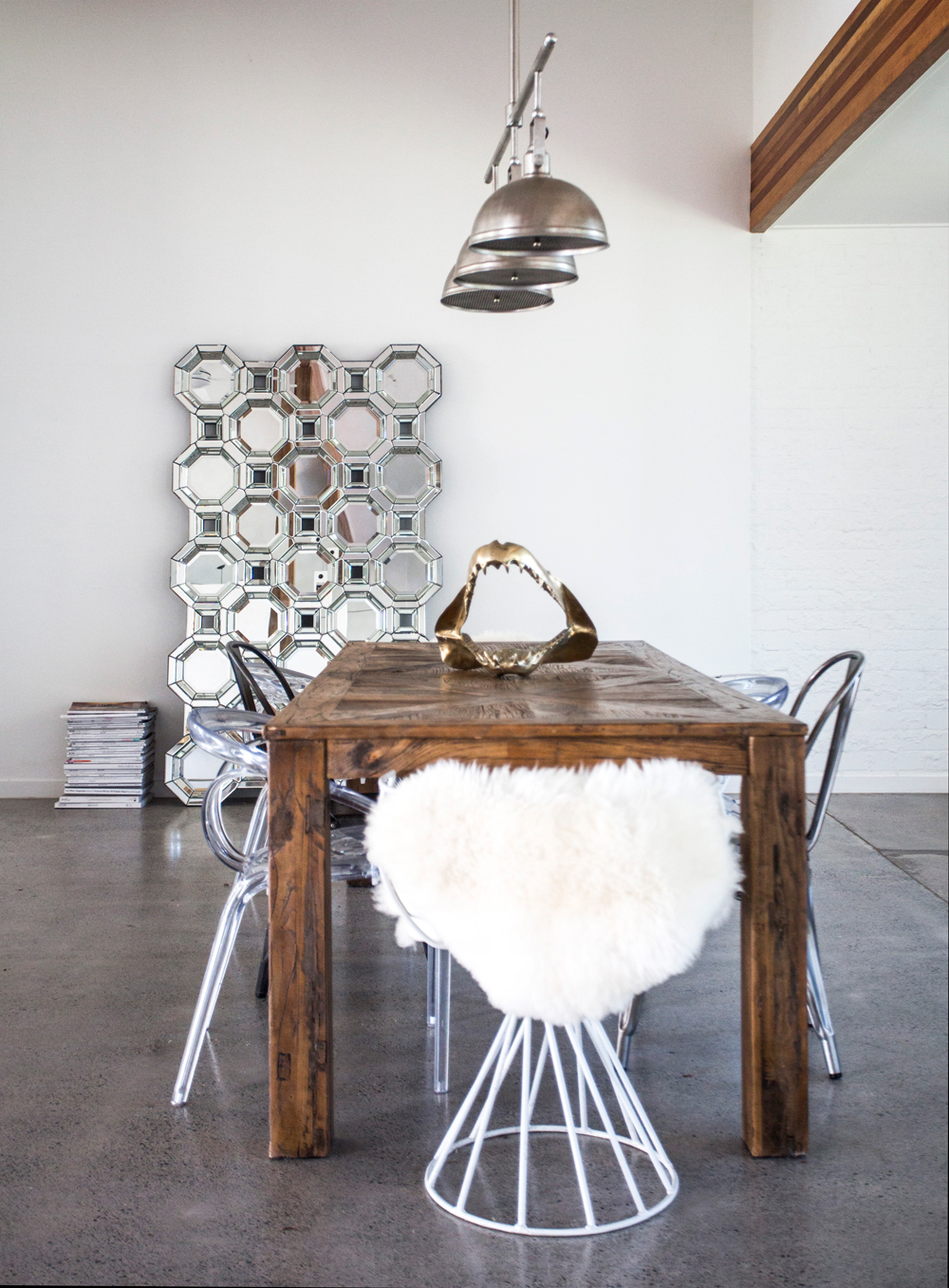
I am in love with the look of a reclaimed wood table with mismatched modern chairs in blogger Amanda Shadforth’s home. And that quirky gold shark jaw is an unexpected centerpiece for that table! Image source: Oracle Fox
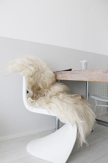
I think the curved silhouette of a vintage Panton chair will be stunning next to reclaimed wood, and you know how much I love an opportunity to discuss furniture design history!
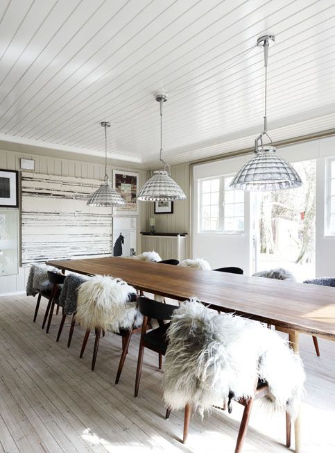
Image source: Stine Langvad
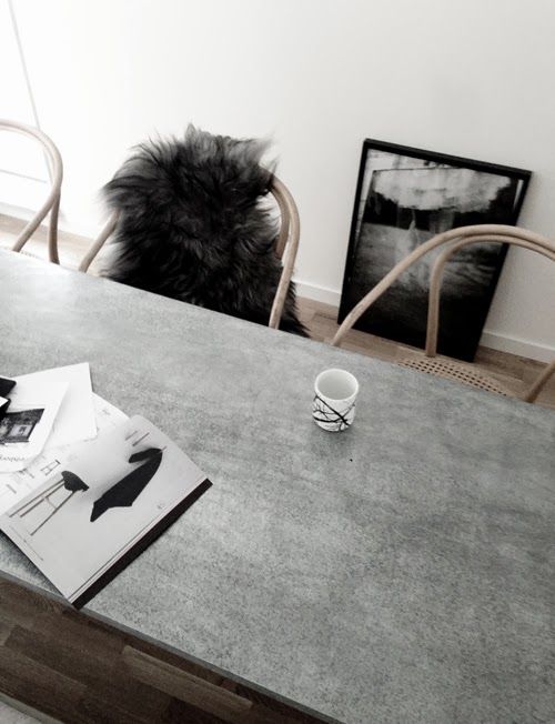
Image source: Pella Hedeby
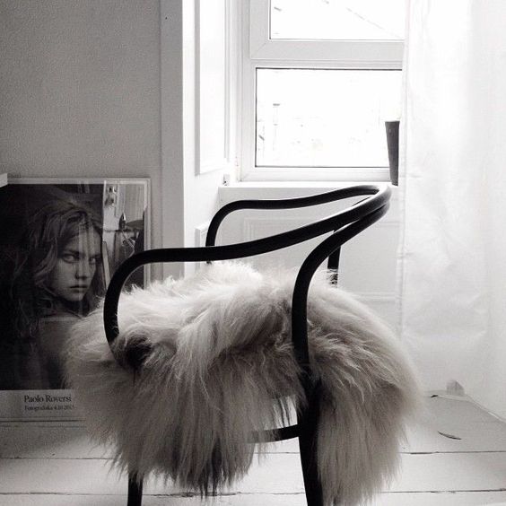
Image source: unknown
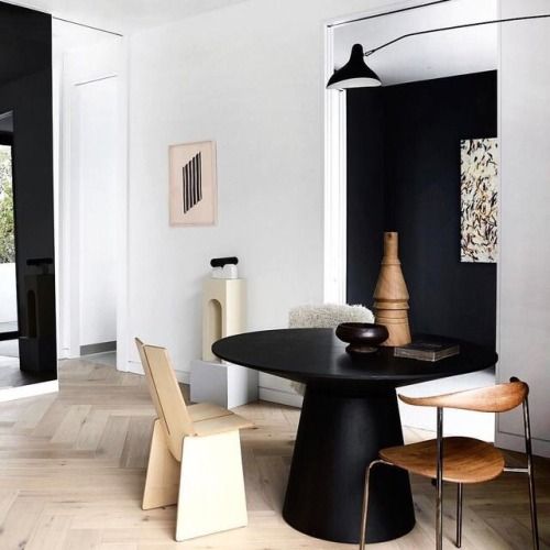
Mixed chairs. Image source: copenhagendepictions
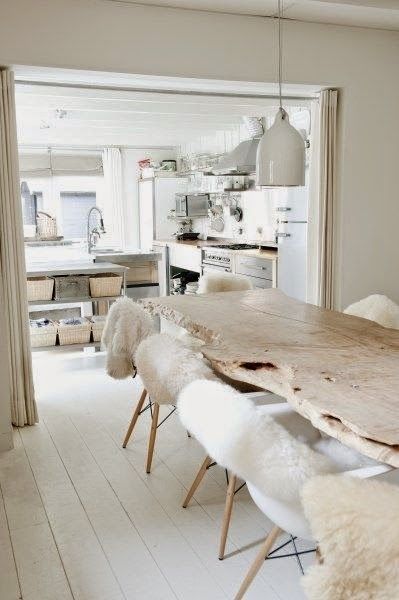
Image source: scandimagdeco
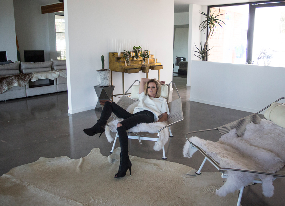
The only thing better than one Hans Wegner Flag Halyard chair, is two. I was lucky enough to score this same one last year at a Rove Concepts warehouse sale for 70% off (worth the early morning camp out!). Image source: Oracle Fox
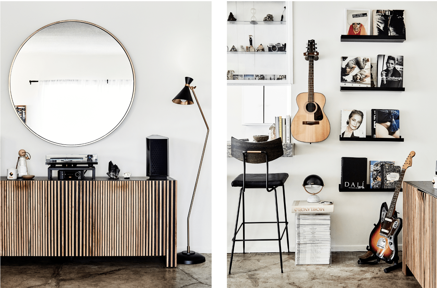
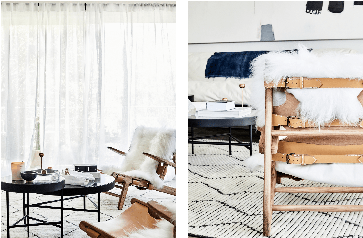
This is how I envision mixing touches of black and masculine pieces. Yes to those round coffee tables. Image source: Sasha Strebe
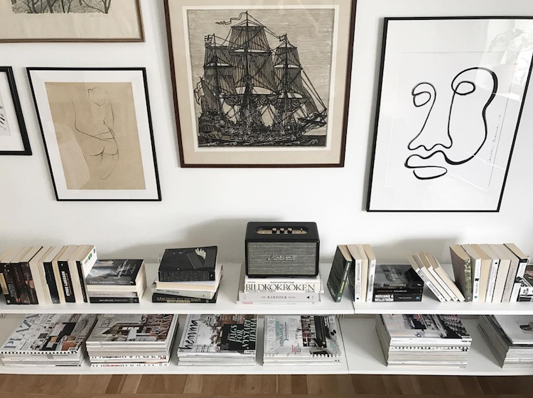
Open shelving to house our growing library of books on interior design, film, and art. I’d like to put my flag halyard chair to use and create a reading corner by the windows. That marshall speaker has already found its place on my mood board as well! Image source: Hannah Ahlin
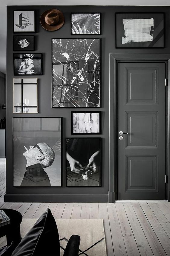
A monochrome gallery wall is a must. Image source: unknown
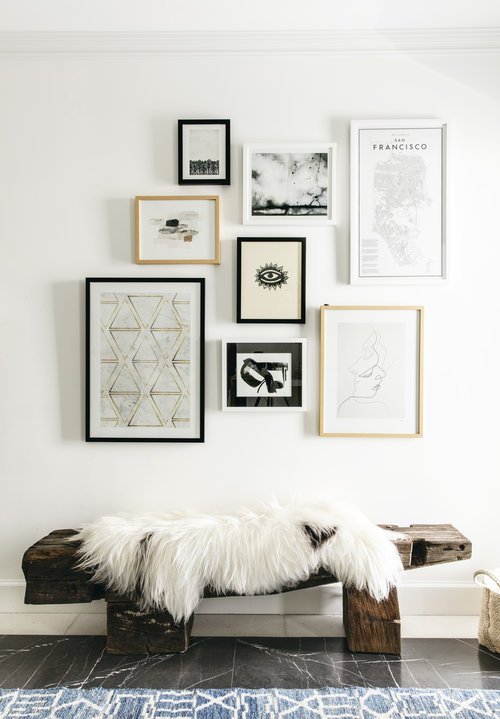 Love the reclaimed wood bench. Image Source: Lauren Nelson Interiors
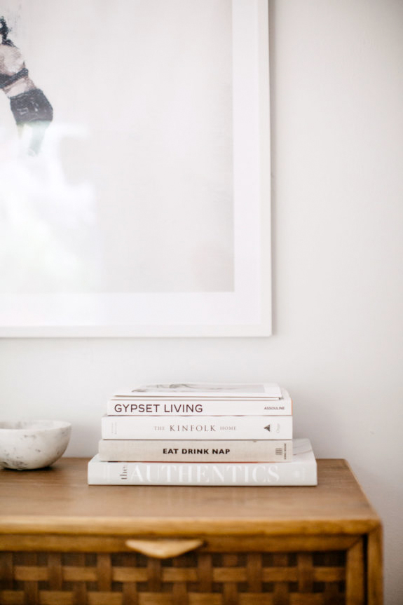
Image source: sfgirlbybay
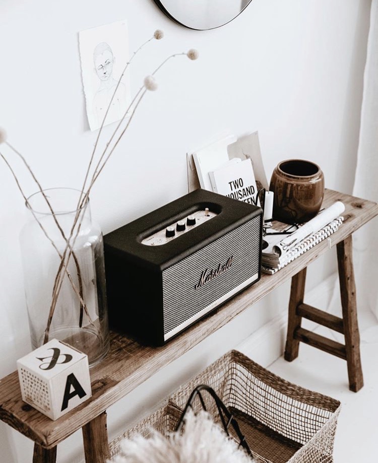
Image source: conceptbyanna
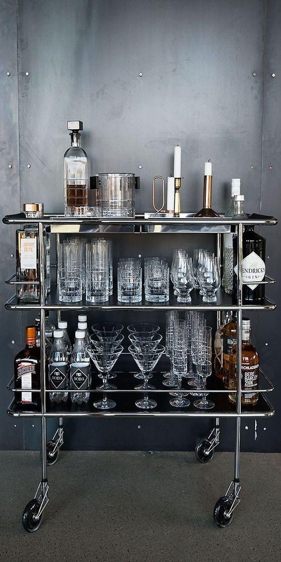
A bar cart stocked with aesthetically-pleasing bottles of liquor and glassware. Image source: unknown
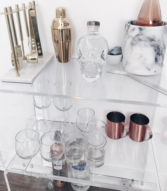
Image source: Lauren Elizabeth
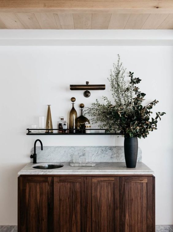
Image source: elix forest for est magazine
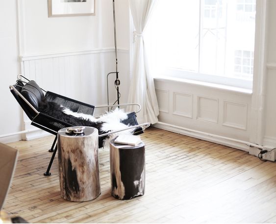
The apartment by The Line. Image source: unknown
You can follow along on my Instagram stories to see more progress in between blog posts! And I’m always pinning away new inspiration on my new place inspiration Pinterest board.

December 26, 2018
Stay Inspired
Subscribe below to get new blog posts, updates, and inspo straight to your inbox.