Best of Pinterest: The 8 Images That Inspired Me Most in 2018
It’s quite the journey to look back at the images I found meaningful enough to save throughout a year– all 2,237 to be exact! In retrospect, what I instinctually loved most then is still what I love most now. Some pins I had completely forgotten about – and rediscovering them was like being hit with inspiration all over again. Others (like the banana palm wallpaper moment I had a quick obsession with), I’m glad to have come and left. Among the organized chaos, here are the eighteen interior design and decor moments that inspired me most (and still do now):
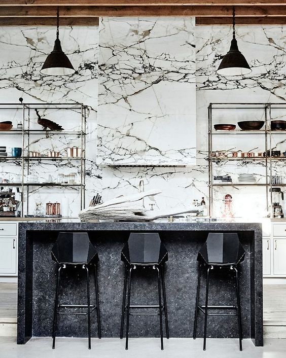
1. Denise Vasi & Anthony Mandler’s Kitchen
Marble, unsurprisingly, was a common theme. Unique veining and high contrast patterns are what I gravitated towards most. This STUNNING kitchen in Denise Vasi and Anthony Mandler’s Venice beach home still gives me chills.
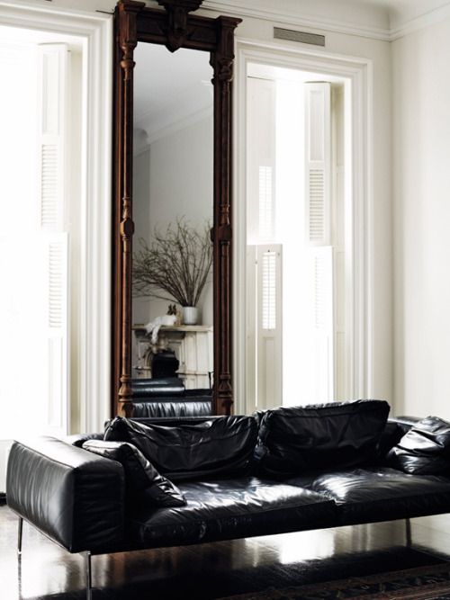
2. The Black Leather Sofa to End All Sofa’s
This image of Liana Pai’s living room in ELLE Decor Sweden single-handedly led me down into a deep dark Pinterest binge of black leather sofas with low, clean lines. A few months later, I made my first adult purchase with this Article black leather sofa.
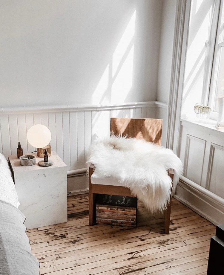
3. The Dreamiest Loft at The Apartment by The Line
Sheepskin was another repeat offender, particularly when paired with ultra-modern statement chairs. This was one of many images of The Apartment – a stunning Soho loft by The Line that acts as their living breathing showroom for all things decor, furniture, and fashion.
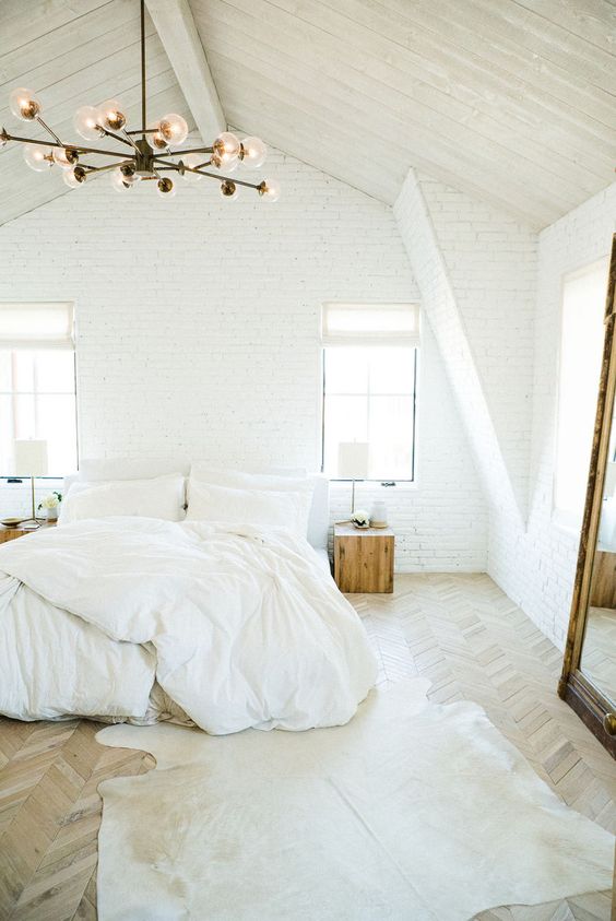
4. All-White Everything by Leanne Ford
I fell in love with Leanne Ford’s white on white signature aesthetic after discovering photos floating around of the designer’s first design project – a 1907 schoolhouse that she restored into her own home. Her work is definitely my biggest inspiration for not just my own design aesthetic, but this blog’s existence!
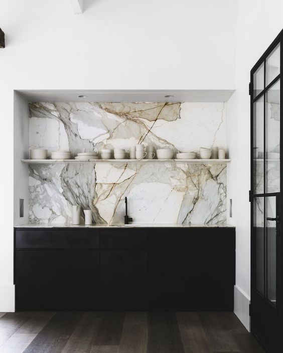
5. The Most Beautiful Marble Slab, Ever
This kitchen belongs to the most perfect home tour I have ever laid eyes on. Designed by Aussie legends Handelsmann + Khaw, the home is full of minimal monochrome goodness with just enough marble and matte black.
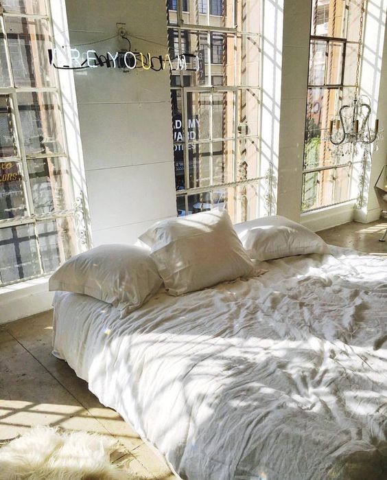
6. Light & Airy Los Angeles Loft
I knew I needed to recreate Are You Am I’s LA showroom in my own bedroom as soon as I laid eyes on it. Yes I needed a white neon sign above my bed.
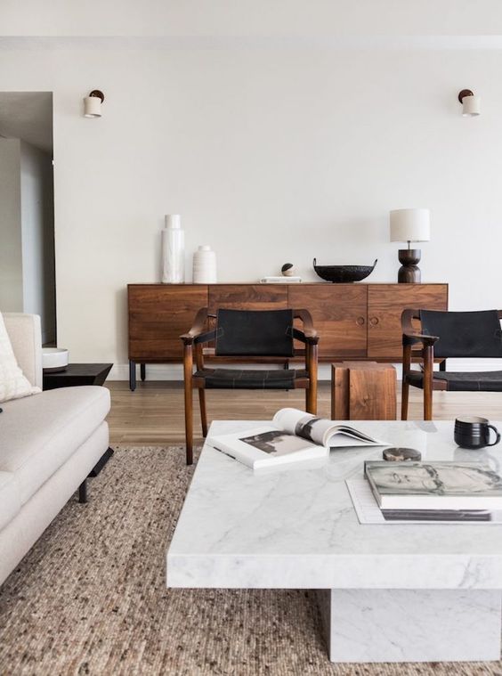
7. Walnut, Leather and Marble Combo
This renovation reveal was one of many wood-marble-black-white combinations I became obsessed with this year. In retrospect, I can credit this image as the turning point when my all-white obsession transitioned to an “all-white with wood, marble, and matte black mixed in” obsession.
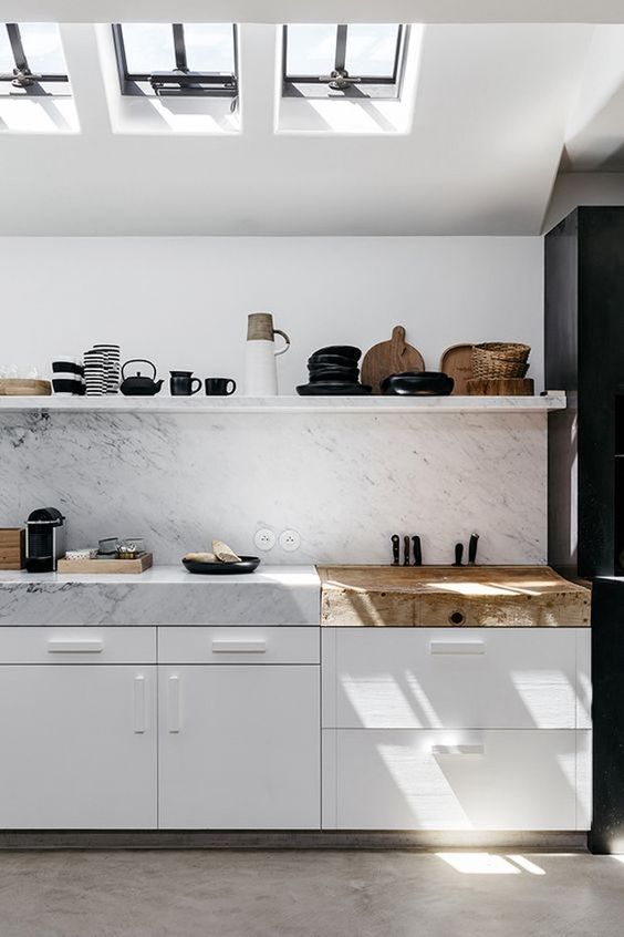
8. Open Shelving
I’ve never been a fan of the open shelving trend until I saw this utterly stunning kitchen by Peter Ivens. Sticking to only three materials–black, white, and a single tone of wood–keeps the shelves from looking cluttered and busy. I also love how the marble is continued up the shelf seamlessly. And those thick countertops??? I die.
So that’s that. In hindsight, it’s clear how influential these images were to my previous bedroom design and also in dreaming up the mood board for our new apartment. I hope they inspired you as much as they did me!
Hop on over to my Pinterest for more inspiration and interior design musings.

December 31, 2018
Stay Inspired
Subscribe below to get new blog posts, updates, and inspo straight to your inbox.